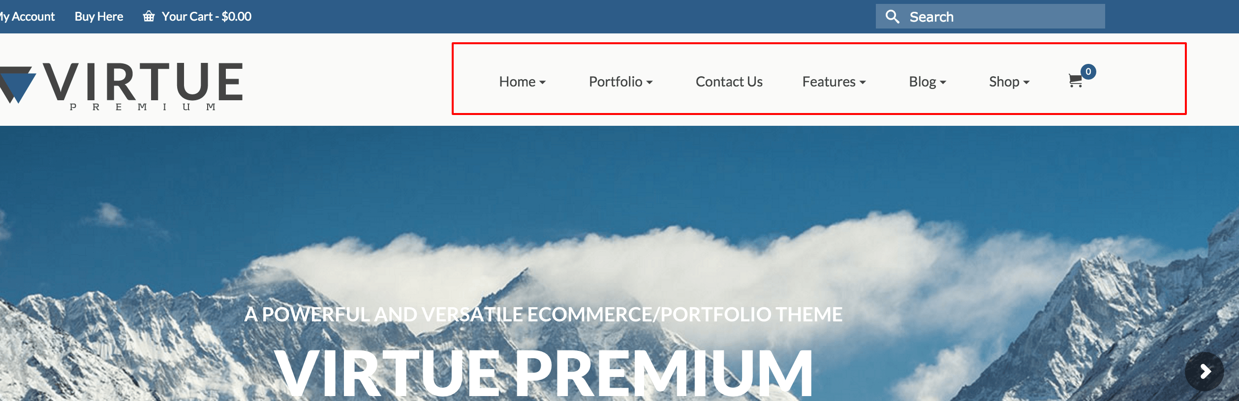
Primary Navigation
The Primary menu is either located on the right or center just below your logo. (depends on your logo layout setting). The menu font and style can be edited on your theme options >> typography page. This menu disappears for mobile and is meant to be replaced by setting up a Mobile Menu.
Primary Menu Font
Choose size and style for primary menu.
Primary Menu Hover and Active Font Color
This font color will display when being hovered over by mouse or when it is active.
Primary Menu Hover and Active Background Color
This background color will display when being hovered over by mouse or when it is active.
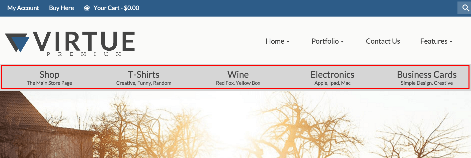
Secondary Navigation
The Secondary menu is located at the bottom of the header below the logo and primary menu. The menu font and style can be edited on your theme options >> typography page. This menu disappears for mobile and is meant to be replaced by setting up a mobile menu.
Secondary Menu Font
This will set the size and style on your secondary menu
Secondary Menu Hover and Active Font Color
This font color will display in the secondary menu when being hovered over by mouse or when it is active.
Secondary Menu Hover and Active Background Color
This background color will display in the secondary menu when being hovered over by mouse or when it is active.
Secondary Menu Item Size
This will determine the number of menu items that fit in the menu.
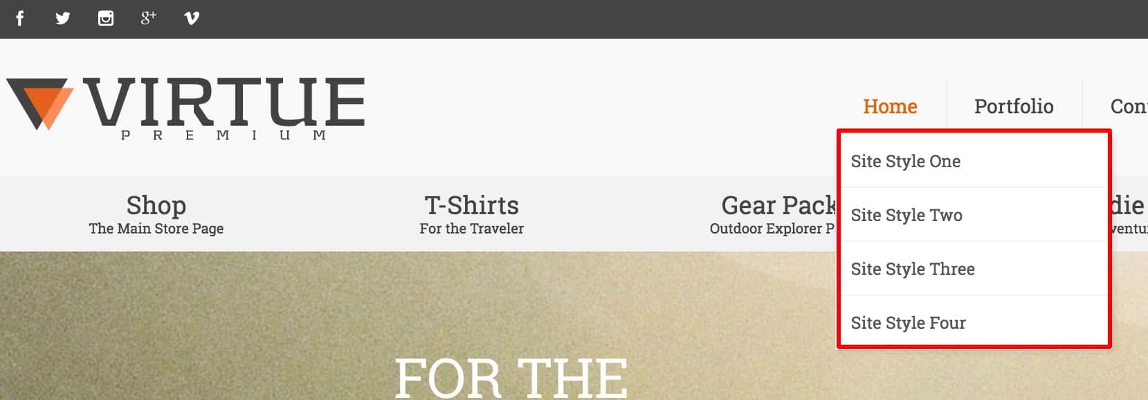
Dropdown Navigation
Dropdown Font Color
Choose a color
Dropdown Background Color
Choose a color
Dropdown Border Color
Choose a color and whether or not you would like transparency.
Mobile Navigation
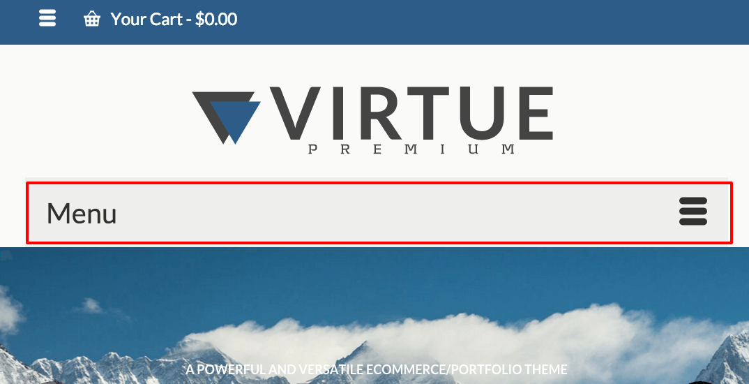
Mobile Menu Only Show Button
Turn on to hide menu text
Mobile Menu Font
Choose size and style for mobile menu
Mobile Hover and Active Font Color
Choose a color
Mobile Hover and Active Background Color
Choose a color
Topbar Navigation
The topbar menu is located in the topbar on the left side. This menu doesn’t not change for mobile devices so use caution when adding a lot of items to this menu.

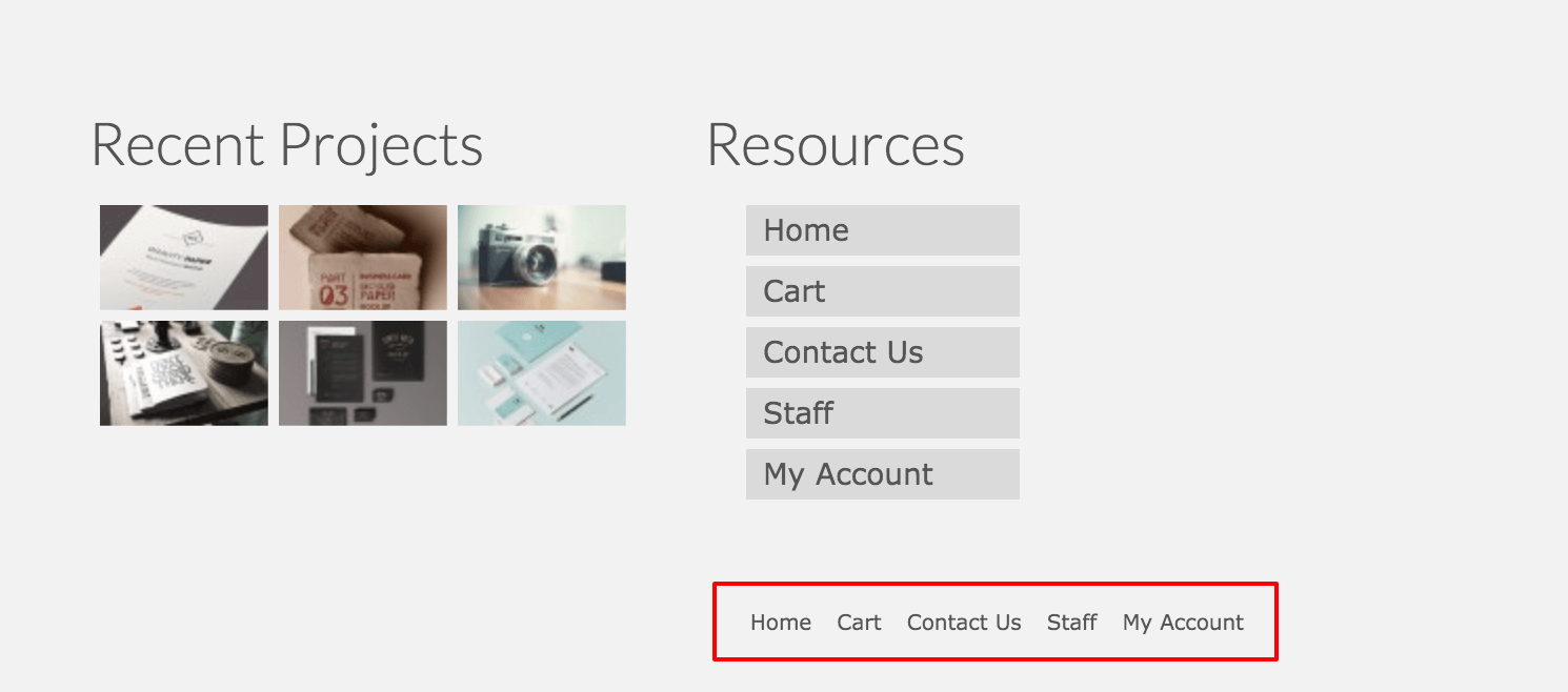
Footer Navigation
The footer menu is located in the bottom right corner of your site. It is not designed to be used with submenus.